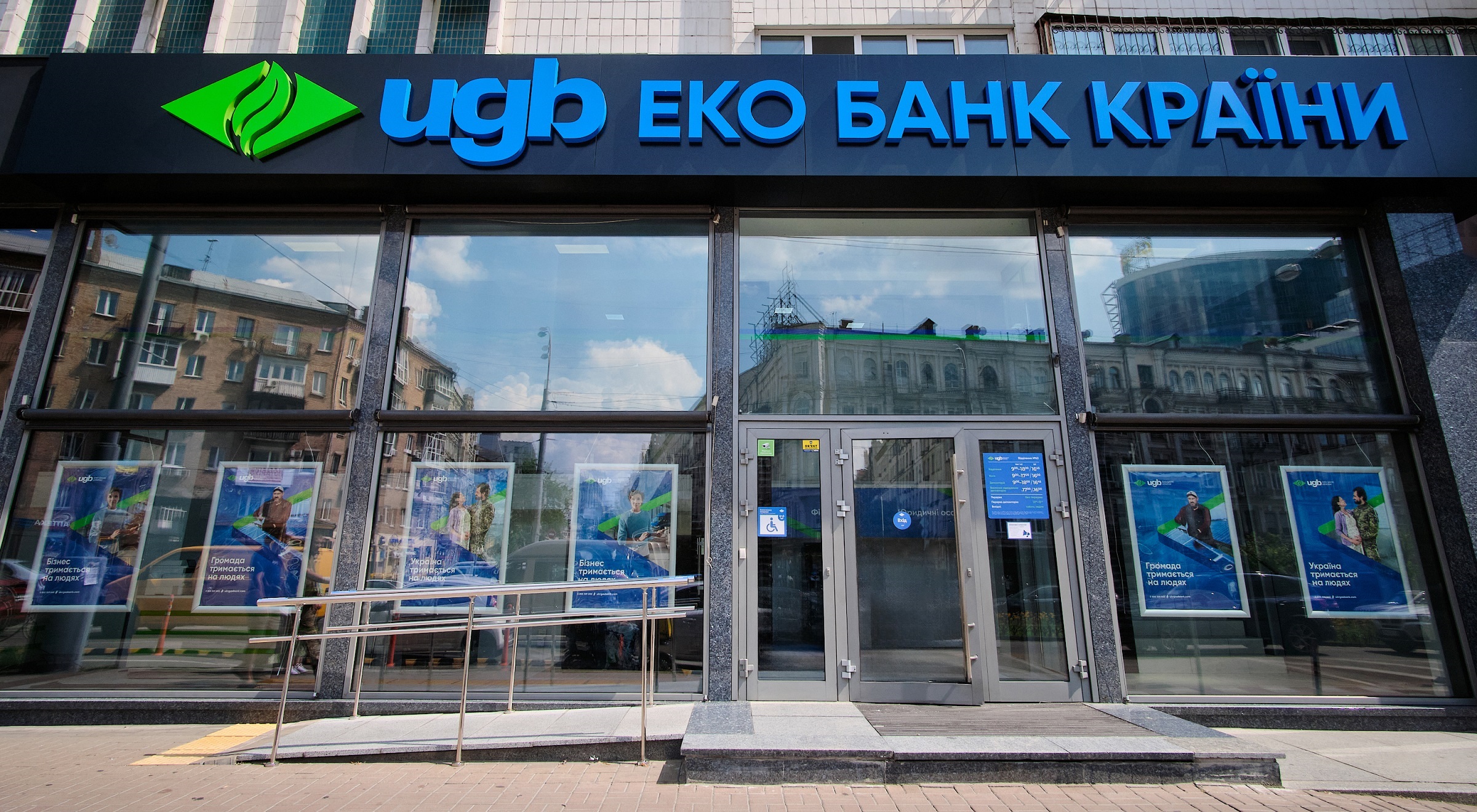
UGB Eco Bank. Ukrgasbank Changes Brand Positioning and Corporate Style
Ukrgasbank has undergone a restyling, changing its brand positioning and corporate style. From now on, Ukrgasbank will use the name "UGB - Eco Bank" and a new identity, including a new logo, in its communications. The updated brand positioning takes into account the new meanings and challenges that have arisen during the full-scale war, while maintaining the bank's unwavering focus on environmental sustainability. However, Ukrgasbank has not officially changed its name.
A Bank Acting in the Interests of Ukraine, Communities, and Businesses
The bank’s abbreviation "УГБ" has been transformed into "UGB" in Latin script. Each letter of the abbreviation reveals the three vectors, the three target audiences that the bank focuses on and acts in the interests of. These are Ukraine, Communities, and Businesses (standing for “Україна. Громада. Бізнес” in Ukrainian).
In the context of the full-scale invasion, Ukraine and Ukrainians are forced to live and work in completely new conditions. We see our mission as helping the state strengthen the economy, helping businesses recover and continue operating, and helping communities rebuild and develop,
Of Course, the Country's Eco Bank
We retained our unique “eco bank” attribute in the logo, emphasizing the global factor of the eco-direction that the bank has been developing across the country since 2016. Given the established market knowledge of the bank as a leader in financing renewable energy projects, we maintain “green” banking as an important attribute of the updated Ukrgasbank brand. Additionally, the eco bank signifies a responsible approach to partnerships, fostering ecological relationships with clients and partners."
No ‘Gas'
Ukrgasbank is a universal bank, so we moved away from the word “gas” in the new positioning as it limited the perception of the brand, and conflicted with the bank's image as an “eco bank.”
Colors of Nature
In its identity, the bank has retained the blue-green color scheme. These colors are most suitable for the country's eco bank as they are the most common shades in nature. Blue represents the color of clear skies and water. Green is the basis of plant life. To further emphasize the bank's ecological focus and the development of 'green' banking, the visual element of the rhombus is now green, and the gas flame image in the logo has been replaced with a green leaf.
Our brand needed an update in identity and positioning. We retained its values and uniqueness as an eco bank and added dynamism and new meanings to be more modern and understandable to our clients and international partners,
07.08.2024


